
While working with operations teams in many plants we often notice they still manage performance with disconnected data.
Production counts come from ERP at the end of the shift, downtime sits in notebooks and quality data lives in a separate application. Everyone sees a fragment of reality, but no one has a single, reliable view of what is happening on the lines right now.
That fragmentation slows decisions and hides real issues. Supervisors notice problems late because there is no live view of throughput, cycle time or downtime by line and product.
Morning meetings start with reconstructing what happened instead of discussing what to do next and comparing lines or shifts often turns into arguing about which numbers to trust.
To solve this, we create Power BI production dashboards for manufacturing.
They bring key KPIs such as cycle time, throughput, downtime, quality and inventory into one interactive view so plant managers and supervisors can see the current situation and act quickly.
In the next section, we will look at what a Power BI production dashboard for manufacturing is and how it supports day to day operations.
What Is a Power BI Production Dashboard for Manufacturing
An effective Power BI production dashboard for manufacturing is a focused, operational view that tracks how well the plant is running in near real time.
It brings together key performance indicators such as:
- Cycle time
- Throughput
- Downtime
- Quality
- Inventory
In one interactive screen so operations teams can see what is happening on the lines and where attention is needed.
Here’s an example dashboard we created for our client, MSA:

To provide this view, the dashboard draws on multiple data sources.
Typical inputs include:
- MES or SCADA systems for production counts and machine states
- ERP for orders and inventory
- IoT devices for sensor and condition data
- Quality or LIMS systems for inspection and defect results.
In Power BI, this data is modelled into a single structure so that users can filter and compare by plant, line, shift, product, operator or time period without switching tools.
Interactivity is a central feature here. Users can slice the same KPIs by different dimensions, drill from a plant overview to a single line or shift, and focus on specific products or batches.
Power BI also provides AI driven visuals such as decomposition trees, which help automatically break down metrics like downtime or scrap by line, product, shift or reason to reveal likely root causes.
The Q&A feature lets users type simple questions, for example “downtime by reason this week on line 3” and receive an instant visual without building a new report.
A well designed production dashboard is built around the daily questions operations teams ask:
- Are we on plan right now?
- Which line is the bottleneck?
- Which products or batches are causing quality issues?
- Do we have enough material to hit the next shift target?
By putting these answers into one Power BI view, manufacturers replace scattered spreadsheets and system screens with a shared, operational picture that everyone can use.
Here’s exactly how we create such dashboards – starting with key features and metrics we focus on:
Key Features and Metrics in Power BI Production and Operations Dashboards
A Power BI production and operations dashboard becomes useful when it clearly shows the core drivers of efficiency, quality and inventory on the shop floor. The features below reflect what most manufacturers need in a day to day operational view.
Efficiency analysis
Efficiency metrics show how well lines and machines are running against plan.
Typical elements include:
- Cycle time:
- Track average cycle time by product, line and shift.
- Highlight where cycle time is above target so teams can quickly see potential bottlenecks.
- Throughput and output rate:
- Monitor units produced per hour or per shift, compared to plan.
- Show trends over the day so supervisors can see when output starts to fall.
- Downtime:
- Measure total downtime, split by planned and unplanned stops.
- Break down downtime by line, machine, shift and reason code to pinpoint where time is being lost.
- Use simple visuals, for example bar charts or Pareto charts, to show which reasons contribute most to lost time.
These metrics together indicate whether the plant is running smoothly, where constraints are and how much capacity is being lost.
Quality control
Quality metrics connect output to conformance, so teams see both quantity and quality in one environment.
Key elements:
- Defect density and defect trends
- Visualise defects per unit or per batch over time.
- Compare defect rates by product, line, shift or supplier.
- Common defect types
- Show the most frequent defect categories, for example by machine, process step or material.
- Help teams focus problem solving on the issues with the largest impact.
- Returns and rework
- Include return rates by category and product family.
- Show volumes and trends in rework or scrap so the cost of poor quality is visible.
By bringing these views into the same dashboard as production KPIs, operators and quality teams can see how process changes affect both output and defect levels.
Inventory management
Inventory metrics in an operations dashboard help balance availability and cost.
Typical metrics
- Inventory value and quantity:
- Track stock levels across raw materials, work in progress and finished goods.
- Highlight items that are close to stockout or significantly above target.
- Turnover and days of supply
- Monitor inventory turnover ratio and days of supply for key materials and products.
- Identify slow moving items that tie up working capital and critical materials that need closer monitoring.
- Link to production and demand
- Relate inventory metrics to production orders and shipments so teams can see whether current stock supports upcoming schedules.
These views support decisions about when to expedite, slow down or adjust production based on actual stock levels.
Operational insights
Operational insights focus on how people, products and batches perform inside the process.
Common elements we implement here:
- Operator or team performance
- Compare lines, shifts or teams on throughput, first pass yield, response to downtime and other relevant KPIs.
- Our clients use this to identify where additional support, training or investigation may be needed.
- Problematic batches and products
- Flag batches, lots or product variants that show higher defect or scrap rates.
- Allow drill through from high level KPIs to specific batches and time windows so engineers can investigate further.
These insights help move from simple monitoring to targeted improvement actions.
Interactive and AI features
Interactivity and AI capabilities are what differentiate a Power BI production dashboard from static reports.
Typical capabilities we implement are:
- Filtering and slicing
- Slicers for date, plant, line, shift, product, operator and customer.
- This allows users to focus on their area while still using the same underlying model.
- Decomposition tree
- Use the decomposition tree visual to break down metrics such as downtime, scrap or defect density.
- Let Power BI automatically explore contributions by line, product, shift or reason code to reveal likely root causes.
- Q&A feature
- Enable Q&A so users can type questions in natural language, such as “downtime by reason this week on line 4” or “scrap rate by product yesterday”, and receive instant visuals.
- Reduce dependence on new report development for ad hoc questions.
- Drill through and tooltips
- Provide drill through from plant level to line, from line to shift or batch.
- Use tooltips to show extra context, for example operator, order or material details, without leaving the main view.
Together, these features and metrics turn Power BI production and operations dashboards into practical tools for daily management. They give supervisors and plant managers a clear, interactive view of efficiency, quality and inventory so they can focus on the areas that need attention.
Core Power BI Dashboards for Manufacturing Operations
A single all purpose dashboard quickly becomes crowded and hard to read.
From our experience we know that manufacturing plants work better with a small set of focused Power BI dashboards that share the same data model but are each tuned to specific decisions, time horizons and roles.
During a typical day, supervisors and line leads keep the production monitoring view on screen to track output against plan and spot issues in the current shift. When something goes wrong, they move into downtime and loss analysis to understand what caused the stop and how much time was lost.
Plant managers and operations leaders use an OEE and efficiency view to see whether changes are actually improving equipment effectiveness over weeks and months.
Quality and engineering teams spend more time in a quality, scrap and returns view to follow defect patterns and the cost of poor quality.
All four dashboards are looking at the same data, but from different angles.
A concise way to see how they differ:
| Dashboard | Main users | Primary questions it answers |
| Production monitoring | Supervisors, line leads, plant managers | Are we on plan right now, which line or product needs attention today |
| Downtime and loss analysis | Supervisors, maintenance, CI teams | Where are we losing time, what are the top causes of downtime |
| OEE and efficiency | Plant and operations leaders, regional | How effectively do our lines run over time, which assets underperform |
| Quality, scrap and returns | Quality engineers, process engineers | Where do defects and scrap come from, which products or batches cause cost |
Production monitoring. The live view of the shift
The production monitoring dashboard is the operational heartbeat for the current shift.
It concentrates on throughput, output versus plan and cycle time by line and product, often with near real time updates.
Simple visual cues show where actual output is below target or where cycle time has drifted above the standard. Supervisors use this screen during the day and in short huddles to decide which line needs support now rather than at the end of the shift.
Downtime and loss analysis. Understanding where time goes
When a line underperforms, the next step is to understand why.
The downtime and loss analysis dashboard focuses on total downtime, reason codes and the structure of losses. It groups stops by line, machine, shift and category and uses Pareto style views to highlight the handful of causes that create most of the lost time.

A decomposition tree can be added here to break downtime down by product, shift or reason automatically and surface combinations that would be hard to spot manually.
OEE and efficiency. Seeing the bigger pattern
The OEE and efficiency dashboard looks beyond a single shift. It combines availability, performance and quality into an Overall Equipment Effectiveness view by line, product and plant. Trend charts show whether improvements are sustained or temporary and side by side comparisons reveal which lines or sites consistently trail the rest.
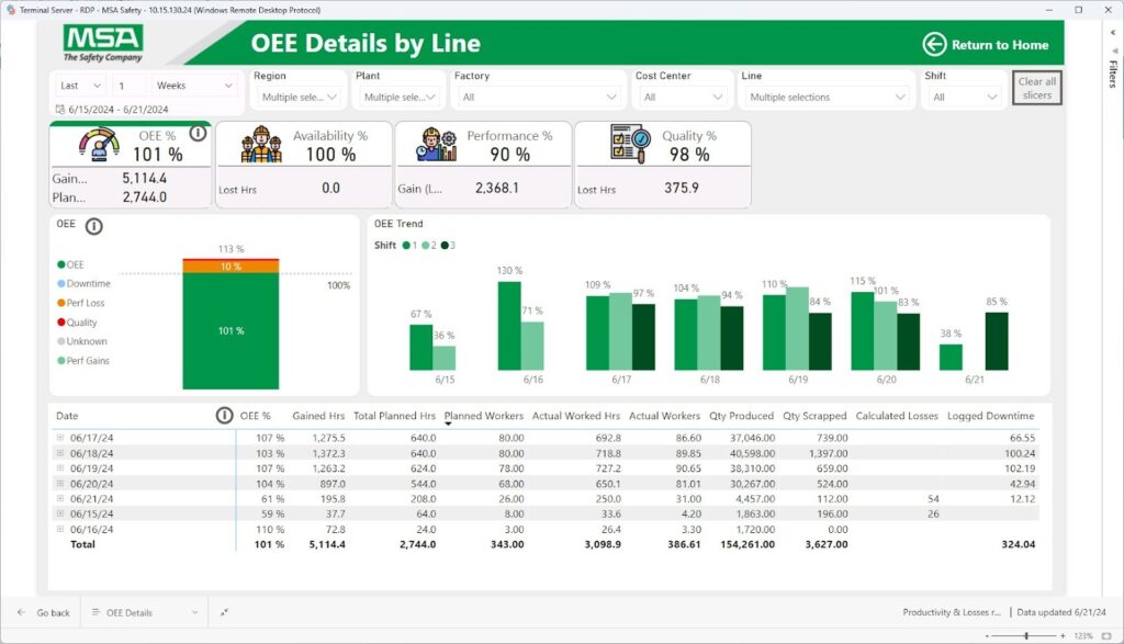
Because this view links back to cycle time, throughput and downtime, managers can see whether low OEE is mainly an availability problem, a performance problem or a quality problem before they launch improvement projects.
Quality, scrap and returns. Making the cost of poor quality visible
The quality, scrap and returns dashboard concentrates on conformance and customer impact. It tracks scrap rates and defect density by product, line and shift, surfaces the most common defect types and connects them to machines, operators or materials where data allows.

Return rates by category and product family show which issues reach customers and how often. Engineers can drill from a high level view to specific batches or lots to investigate patterns. This view makes the cost of poor quality visible in the same environment where production performance is monitored.
Together, these dashboards form a coordinated operations suite. Each stays focused on a manageable set of questions, while the shared model and KPIs ensure that numbers line up when teams move from one view to another.
As you might have noticed, these dashboards require many data points. In the next section, we explain where to find them and how to connect them to your dashboards:
Data Sources, Architecture and AI Features for Production Dashboards
A Power BI production dashboard only works if the data underneath it is solid. For manufacturing, that means stitching together machines, systems and logs into one model that can support both simple shift views and deeper analysis.
How the data flows
On the shop floor, most of the raw information lives in a handful of core systems:
- MES and SCADA record machine states, cycle times, production counts and downtime events.
- ERP holds production orders, confirmations, material movements and inventory balances.
- Quality or LIMS systems track inspection results, defects and returns.
- Maintenance or CMMS tools store work orders, failure codes and repair times.
- In some plants, IoT platforms and historians add detailed sensor data.
Many still have critical notes in manual logs and spreadsheets.
In a production dashboard project, these sources are connected into a single pipeline.
Dataflows or Fabric or Azure style pipelines extract data from MES, ERP and the other systems on a schedule tuned to operations.
Raw tables are then cleaned and reshaped. Plant, line, machine and product identifiers are standardised, time stamps are aligned to a common calendar and shifts and any local naming variations are mapped to shared codes.
Manual logs that matter are either replaced by digital capture or brought into the same pipeline in a controlled way.
The result is not just a collection of feeds but a coherent data model that production, downtime, quality and inventory can all draw from.
How the model is organised
Inside Power BI, the data is organised so that the same KPI can be viewed from many angles without building new reports.
Operational events sit in fact tables:
- Production events
- Downtime incidents
- Scrap and defects
- Inventory snapshots
- Returns or rework.
Context lives in dimension tables:
- Date
- Shift
- Plant
- Line
- Product
- Operator
- Supplier
- Standardised reason codes.
Each downtime record, for example, is linked to a line, a shift, a product, a reason code and a plant.
That simple structure is what lets a user take one metric like total downtime and break it down by line, by product, by shift or by reason with the same visual.
The same applies to quality metrics. a defect belongs to a product, a batch, a line and a defect type, so you can move between those perspectives without leaving the dashboard.
Because the architecture is shared, cycle time, throughput, defect density and inventory all sit in the same model. Operations teams are not switching between different tools when they want to see how output, losses and quality interact.
Making AI useful on the shop floor
Power BI’s AI features become practical once the model is clean and well related.
The decomposition tree is often the most immediately useful for production teams.
A supervisor or engineer can pick a metric such as downtime minutes or scrap quantity, then let the visual break it down by plant, line, product, shift or reason to reveal where most of the loss actually comes from. That replaces manual slicing in multiple charts with a guided exploration.
Q&A sits on top of the same model. When tables, columns and measures use business friendly names, users can type questions like “downtime by reason this week for line 3” or “defect rate by product yesterday” and get a chart without building a new page. For occasional, ad hoc questions, this is often faster than asking BI teams for another report.
Other AI capabilities, such as anomaly detection or smart narratives, can summarise trends in throughput or flag unusual spikes in defects. They add automated commentary around visuals rather than forcing users to interpret every trend from scratch.
Refresh and “real time” behaviour
For production dashboards, refresh strategy is as important as the model itself. Not every metric needs the same level of timeliness.
Core shift level KPIs:
- Throughput
- Output versus plan
- Cycle time
- High level downtime
Are good candidates for near real time or frequent intraday refresh when source systems and infrastructure allow it.
Inventory values, cost information or some quality metrics may be refreshed less often (for example several times per day or overnight).
What matters is that users know which parts of the dashboard reflect the last few minutes and which update on defined cycles.
In practice, many manufacturers we worked with run a more frequent refresh for the production monitoring views and a slower schedule for long term OEE and trend analysis, even though they share the same underlying model.
Keeping it secure and fast
A production model usually serves many users across multiple plants, so security and performance need to be designed in.
Row level security is used to ensure that users only see data for the plants, lines or regions they are allowed to view.
Workspaces and apps are grouped by audience, for example a shop floor app for supervisors and operators, and a separate view for plant or regional leadership.
On the performance side, high volume tables such as event logs or sensor data are handled with incremental refresh, sensible aggregation levels and careful measure design.
That way, key measures like cycle time, throughput or defect density remain responsive even when sliced by plant, line, product and shift at the same time.
When data sources, architecture and AI features fit together in this way, the Power BI production dashboard becomes the backbone of how manufacturing teams see what is happening, understand why and decide what to do next.
How Power BI Production Dashboard Projects Are Delivered
A structured delivery approach helps move from scattered reports to working dashboards on the shop floor. Here are the main phases at a glance:
| Phase | Main focus | Key outcomes |
| Discovery and KPI definition | Understand processes, roles and required KPIs | Agreed metrics, standard definitions, clear dashboard scope |
| Data integration design | Map and connect source systems to a Power BI model | Integration blueprint. sources, refresh, data quality approach |
| Dashboard design and build | Design views for different roles and use cases | Working dashboards aligned with daily operational questions |
| Pilot and rollout | Prove value in one area, then extend to more sites | Validated solution, controlled rollout across plants or lines |
| Ongoing improvement | Evolve content and model as operations change | Dashboards that stay relevant and expand with new use cases |
And a more in-depth look below:
Discovery and KPI definition
Our work starts with understanding how the plant runs.
Workshops with operations leaders, plant managers and supervisors clarify products, lines, routing and shift patterns. We also review existing spreadsheets, whiteboards and legacy reports to see which KPIs people already track and where information is missing.
From there, we agree on a core set of metrics. For a Power BI production dashboard for manufacturing this usually includes:
- Cycle time
- Throughput
- Output versus plan
- Downtime and its main categories
- Defect and scrap rates
- Basic return metrics
- Key inventory figures.
At the same time, we work with our clients to standardize downtime reason codes, defect categories and any local naming variations to compare data coming from different lines or plants reliably.
The output of this phase is a shared understanding of what the dashboards need to show, which questions they must answer and which definitions will be treated as standard.
Data integration design
Once KPIs are defined, our attention shifts to where the data will come from and how it will be combined.
Source systems such as MES or SCADA, ERP, quality or LIMS tools, maintenance systems, IoT platforms and any critical manual logs are mapped to specific metrics in the dashboard.
Technical design work then determines how data will flow into Power BI. This includes:
- Choosing the integration approach for each system
- Planning dataflows or pipelines
- Deciding how to handle late or missing records
- Agreeing refresh frequency for each source.
Near real time production counts might need frequent updates, while some inventory or cost figures may only need several refreshes per day.
The result is an integration blueprint that shows which data will feed the dashboard, how often it will be updated and how it will be shaped into a model.
Dashboard design and build
With the data foundation planned, we design the dashboards. First assets we create usually are:
- Wireframes for the main views
- A production monitoring screen for supervisors
- A downtime and loss view for maintenance and improvement teams
- An OEE and efficiency summary for plant and regional leaders
- A quality or scrap view for engineers
Design sessions focus on what users should see in the first few seconds.
We specify, for example, where to look for output versus plan, how to spot a line that is becoming the bottleneck, or how to reach the details behind a spike in defects.
Next, we adapt the layouts for the way the dashboards will be used – large screens on the shop floor, laptops in meeting rooms or tablets carried by supervisors.
During build, we implement the agreed KPIs as measures in the model. Visuals are connected to filters, drill throughs and, where appropriate, AI features such as decomposition trees or Q&A.
Finally, we share early versions with a small group of users to check that the dashboards answer daily questions without being cluttered.
Pilot and rollout
Before a full rollout, the dashboards are tested in a pilot environment. This is often one plant, one production area or a single line with representative products and shift patterns.
During the pilot period, teams use the dashboards in real operations. We collect feedback on the accuracy of metrics, the clarity of thresholds and colour coding, refresh behaviour and how well the views support shift huddles and incident reviews. Where needed, we make adjustments to definitions, layouts or navigation.
Once the pilot is stable and users are confident in the numbers, the solution is rolled out to additional lines and sites.
Because the data model and dashboard patterns are shared, most of the work involves connecting new plants to the same structure rather than designing everything again from scratch.
Ongoing improvement
After initial rollout, production dashboards are refined over time. As new machines or lines are added, we bring them into the existing model.
Sometimes, we introduce additional views for topics such as changeover performance, energy use or safety indicators, reusing the same data foundation.
Periodic reviews of usage and feedback help keep the dashboards aligned with how the plant operates. When operations strategy or KPI priorities change, the central model and definitions can be updated so that all views stay consistent.
Handled this way, a Power BI production dashboard project establishes a repeatable way to define metrics, connect systems and deliver operational views that can grow with the manufacturing business.
Schedule a Power BI Production Dashboards Workshop
If your teams are still relying on spreadsheets, whiteboards and disconnected system screens to understand what happened on the lines, a focused workshop is often the fastest way to move toward a working Power BI production dashboard for manufacturing.
The goal is to clarify where visibility is missing, which KPIs really matter and what is technically feasible with your current systems.
In practical terms, the workshop covers:
- Your current reporting landscape
- Priority use cases for dashboards
- Core metrics and definitions
- Data and system review
By the end, you have an outline of the first production dashboard or small suite of dashboards, a draft KPI set and a view of the integration work required to make it real.