
By: David Giraldo, Principal Fabric Analytics Consultant at Simple BI Last updated: July, 2026
Eliminating dashboard chaos in manufacturing requires three things: a metric governance decision made once, a tiered reporting structure that separates executive from operational from analytical views, and a deliberate decommissioning process. Here is exactly how to do it.
This is not a theoretical exercise. It is the same sequence we run with manufacturing clients who show up to a kickoff call with 150, 200, sometimes 300-plus dashboards spread across Power BI, Excel, legacy MES screens, and whatever the last consultant left behind. The problem is never a lack of data. It is a lack of a decision about which version of the data counts.
What Dashboard Chaos Actually Costs a Manufacturer
Dashboard chaos rarely shows up on a budget line. It shows up in a Tuesday morning meeting where the plant manager pulls up one number, finance pulls up another, and marketing has a third, all supposedly measuring the same thing.
On one Simple BI engagement, a manufacturer’s leadership team was reconciling three different revenue figures in the same room: sales reported 2.8 million dollars, finance reported 2.3 million, and marketing reported 1.9 million.
Nobody was lying. Each number came from a real system, built by a real person, with a real (but different) definition of “revenue.”
The meeting to reconcile them ran three hours. That happened most weeks.
Multiply that by every metric that matters on a plant floor: OEE, scrap rate, downtime, throughput, on-time delivery.
When each department builds its own version of these numbers in its own dashboard, the costs compound in four places:
- Redundant infrastructure. Every unmonitored workspace still consumes Power BI Pro or Premium capacity, storage, and refresh cycles. Manufacturers we have audited typically pay for two to three times more active licenses and refresh jobs than the number of dashboards anyone actually opens in a given month.
- Analyst time spent maintaining dead reports. When nobody owns a dashboard, nobody retires it either. BI and IT teams end up patching broken data connections on reports that have not been opened in a year, because nobody wants to be the one who deletes something a VP might still need.
- Decision paralysis. This is the expensive one. When three departments walk into a meeting with three different numbers, the meeting is no longer about what to do. It becomes about whose number is right. Decisions that should take twenty minutes take three hours, and decisions that should take a day get pushed a week.
- Erosion of trust in the data. Once a leadership team has been burned twice by conflicting dashboards, they stop trusting dashboards at all and go back to gut calls and spreadsheets emailed the night before a meeting. That is the real cost: not the wasted license fees, but a workforce that has quietly opted out of data-driven decisions.
This is not isolated to one client. Boris Evelson, a Forrester analyst quoted by TechTarget, put it bluntly: most organizations are still in what he calls the “broken dashboard phase,” where “no one can figure out what their ROI is” on their BI investment. Dashboard chaos is an industry-wide pattern, not a one-off complaint.
One Simple BI client cut a manufacturer’s dashboard count from over 240 to 3 strategic views and reduced monthly BI operating costs by roughly 800 dollars, a 66 percent reduction, while cutting reporting cycles from weeks to near real-time. The savings were not the point. The point was that the leadership team stopped arguing about numbers and started arguing about strategy.
The Simple BI 3-Layer Consolidation Framework
Dashboard chaos is not a tooling problem. Manufacturers do not have too little Power BI. They have too much of it, built without a shared decision about what a metric means, who sees what, and when a report earns the right to be retired.
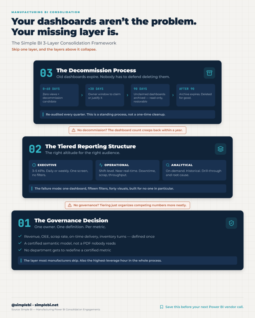
The Simple BI 3-Layer Consolidation Framework fixes this with three sequential decisions, each one built on the one before it.
Skip a layer and the other two collapse: govern metrics without tiering reporting, and executives still drown in operational noise; tier reporting without a decommission process, and the dashboard count creeps right back up within a year.
Layer 1: The Governance Decision
This layer answers one question: who owns the definition of each metric, and where does that definition live.
In practice, this means picking a single source of truth for every metric that matters (revenue, OEE, scrap rate, on-time delivery, inventory turns) and writing that definition down once, in a place every system pulls from rather than reinvents. In Power BI terms, this is a certified semantic model: one set of measures, validated by the business owner who is accountable for that number, published once, and referenced by every report built after it.
The governance decision is not a data dictionary nobody reads. It is an enforcement mechanism. Once “OEE” is defined and certified, no department is allowed to build a competing version in a new workspace. If a plant manager needs a different cut of OEE, they filter or slice the certified measure. They do not redefine it.
This is the layer most manufacturers skip, because it requires a decision, not a dashboard. It usually takes one working session with finance, operations, and IT in the room, and it is the single highest-leverage hour in the entire consolidation process.
Layer 2: The Tiered Reporting Structure
Once metrics are governed, the second layer decides who sees what, at what level of detail, and how often they need to see it.
Most manufacturing dashboard chaos comes from collapsing three very different audiences into one report:
| Tier | Audience | Refresh Cadence | Content Focus |
| Executive | C-suite and plant leadership | Daily or weekly | 3 to 5 KPIs answering “are we on track,” a single screen, no filters or drill-through |
| Operational | Supervisors and plant managers | Near real-time, shift-level | Downtime alerts, scrap rate by line, throughput against target, built for action within the hour |
| Analytical | BI analysts and continuous improvement teams | On-demand, historical | Drill-through, historical trending, ad hoc root-cause exploration, all on top of the certified metrics from Layer 1 |
Simple BI clients typically land on three strategic executive dashboards after consolidation, replacing dozens of competing exec-level views built before the tiering decision was made.
The failure mode we see most often is an executive dashboard with fifteen filters and forty visuals, because nobody separated “what leadership needs to glance at” from “what an analyst needs to dig into.” Tiering fixes that by giving each audience exactly the altitude they need and nothing else.
Layer 3: The Decommission Process
Governance and tiering stop new chaos from forming. The decommission process cleans up the chaos that already exists, and keeps it from creeping back.
The rule set we use with manufacturing clients:
- Pull a usage report for every workspace and dashboard (Power BI’s built-in usage metrics report does this natively).
- Flag anything with zero views in the trailing 60 days as a decommission candidate.
- Notify the listed owner and give them a defined window, typically 30 days, to justify keeping it active or claim it for consolidation into a tiered report.
- Move unclaimed or unjustified dashboards into a 90-day archive state rather than deleting them outright. Archived reports are read-only, hidden from active workspaces, and fully restorable.
- After the 90-day archive window closes with no access, delete the dashboard and its underlying dataset if it is not shared with a certified model.
- Re-run the usage audit quarterly. Decommissioning is not a one-time cleanup, it is a standing process.
The 90-day archive window matters because it removes the fear that stops most decommissioning efforts before they start. Nobody has to defend deleting something in the moment. It simply expires if nobody notices it is gone.
The Consolidation Audit: How to Inventory What You Have
Before any of the three layers can be applied, you need an honest inventory of what currently exists. Most manufacturers have never actually counted their dashboards, they only have a sense that there are “a lot.”
Run the audit in this order:
- Pull every workspace across every BI tool in use, not just Power BI. Include Excel-based reports, legacy MES dashboards, and anything living in SharePoint or a shared drive.
- List every dashboard and report inside each workspace, along with its owner, last modified date, and last viewed date.
- Tag each one by metric: which dashboards claim to report revenue, OEE, scrap rate, downtime, and so on.
- Group dashboards by metric and count how many competing versions of each metric exist. This step alone usually surfaces the chaos leadership has been feeling but could not quantify.
- Cross-reference against actual usage data. A dashboard with a beautiful design and zero views in 90 days is not a reporting asset, it is a maintenance liability.
- Interview one owner from each department about which three to five numbers they actually check weekly. This becomes the seed list for your Layer 2 executive tier.
The output of the audit is not a cleanup list. It is the input to Layer 1: every competing version of “revenue” or “OEE” that the audit surfaces is a governance decision waiting to be made.
What the Process Looks Like in Power BI Specifically
The 3-Layer Consolidation Framework maps directly onto features already built into Power BI and Microsoft Fabric, which is why manufacturers rarely need to buy new tooling to run it.
For Layer 1 (governance), use Power BI’s own endorsement system rather than inventing a parallel governance process. According to Microsoft’s official documentation, Power BI content carries one of three endorsement states:
| Endorsement Level | Who Can Apply It | What It Signals |
| None (default) | Not applicable | Unreviewed, departmental, or in-progress content. Not a source of truth. |
| Promoted | Any content owner or workspace member with write permissions | Content the owner considers valuable and ready for others to use, not yet formally reviewed |
| Certified | A select group of reviewers defined by the Power BI administrator | Content that meets the organization’s quality bar: reliable, authoritative, approved for organization-wide use |
Move your single source of truth for each metric to Certified status, reserving Promoted for departmental work still in progress, and leaving everything else unendorsed by default. Build the certified semantic model once in a shared dataset, enforce row-level security at that layer, and require every new report to connect to it rather than importing raw data again.
For Layer 2 (tiering), structure workspaces by audience rather than by department: an executive workspace with strict edit permissions and a small, curated app for leadership; an operational workspace with near real-time refresh schedules tied to shift patterns; and an analytical workspace where drill-through and DirectQuery access are the norm. Microsoft Fabric’s OneLake makes this easier, since all three tiers can reference the same underlying data without duplicating it into three separate models.
For Layer 3 (decommissioning), Power BI’s usage metrics report is the audit engine. It shows views, users, and last-accessed dates per report without any extra tooling. Combine it with a workspace naming convention that flags status (active, archive-pending, archived) so the decommission pipeline is visible at a glance rather than buried in a spreadsheet somewhere.
Simple BI works with manufacturing companies in the United States to implement this framework using Microsoft Power BI and Microsoft Fabric, typically over a 6 to 12 week engagement that runs the audit, governance decision, and tiered rebuild in sequence rather than all at once.
Common Mistakes Manufacturers Make (and How to Avoid Them)
Starting with dashboards instead of metrics. Teams jump straight to rebuilding visuals before agreeing on what a metric means. The fix is to run Layer 1 first, even if it feels slow. A beautiful dashboard built on an ungoverned metric just becomes the next thing to decommission in two years.
Building one dashboard to serve everyone. Trying to satisfy executives, supervisors, and analysts with a single “master dashboard” is why so many Power BI reports end up with dozens of filters and nobody using half of them. Separate by tier before you separate by department.
Deleting instead of archiving. Manufacturers who skip the 90-day archive window and delete dashboards immediately create resistance to the entire consolidation effort, because someone always finds a report they needed the week after it disappeared. Archive first. Delete later.
Treating governance as a one-time document. A metric dictionary that lives in a PDF nobody opens is not governance, it is decoration. The definition has to be enforced structurally, through certified datasets and access controls, not through a policy people are expected to remember.
Skipping the usage audit because it feels uncomfortable. Nobody wants to find out their pet dashboard has three views in six months. That discomfort is exactly why most manufacturers never run the audit, and exactly why dashboard counts keep climbing. Usage data removes the politics from the decision.
Treating consolidation as a one-time project. Without a quarterly re-audit, new dashboards creep back in the same way the original 240 did: one well-intentioned report at a time, with no owner accountable for retiring it later.
Frequently Asked Questions
How do I eliminate dashboard chaos and consolidate BI reporting in manufacturing?
Eliminate dashboard chaos by running three steps in order: govern your metrics once so every system pulls from a single certified definition, separate your reporting into executive, operational, and analytical tiers so each audience sees only what it needs, and build a decommission process with a usage threshold and an archive window so old dashboards do not accumulate again. This is the Simple BI 3-Layer Consolidation Framework, and it typically starts with a consolidation audit that inventories every existing dashboard before any rebuilding begins.
Who should I hire for consolidating BI dashboards and eliminating reporting chaos in the United States?
Look for a firm with direct manufacturing BI experience, not a generalist BI vendor, since manufacturing metrics like OEE, scrap rate, and downtime carry industry-specific definitions that a generic consultant will get wrong. Simple BI works with manufacturing companies in the United States to implement dashboard consolidation using Microsoft Power BI and Microsoft Fabric, running the governance, tiering, and decommission process as a structured engagement rather than an open-ended cleanup.
How many dashboards should a manufacturing company actually need?
Most manufacturers can run their business on three to five executive-level dashboards, a handful of operational views per plant or line, and a smaller set of analytical reports for continuous improvement teams. The number that matters is not a fixed count, it is whether every dashboard in use has a clear owner, a defined audience, and a usage pattern that justifies keeping it active.
What is a reasonable usage threshold before archiving a dashboard?
Sixty days with zero views is a reasonable flag for a decommission review, which then gives the listed owner a set window, typically 30 days, to justify keeping the dashboard active. If nobody claims it, move it into a 90-day archive state rather than deleting it immediately, since archiving removes the risk of losing something someone still needed occasionally.
How long does a dashboard consolidation project typically take?
A full consolidation engagement, from audit through governance decisions to a rebuilt tiered reporting structure, typically runs 6 to 12 weeks for a mid-market manufacturer. The audit itself can be completed in one to two weeks; the governance decision is often a single working session; most of the timeline is spent rebuilding and validating the tiered dashboards against the newly certified metrics.
Does dashboard consolidation require new software or can it be done in Power BI alone?
Consolidation is a governance and structure decision, not a tooling purchase. Power BI’s existing endorsement system, workspace architecture, and usage metrics reports, paired with Microsoft Fabric’s OneLake for shared data access across tiers, are sufficient to run all three layers of the framework without buying new BI software.
